CSS Checkbox/Radio Button Generator
CSS Checkbox/Radio Button Generator Tool
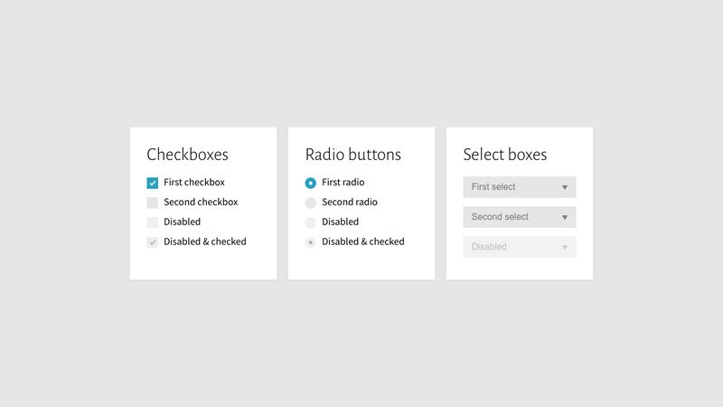
CSS Checkbox/Radio Button Generator is a fantastic tool for web developers looking to create visually appealing checkboxes and radio buttons for their websites. This tool provides an intuitive way to customize checkboxes and radio buttons using CSS, saving developers time and effort in building unique and responsive forms.
Why Use a CSS Checkbox/Radio Button Generator?
Checkboxes and radio buttons are essential for web forms, used widely for options like terms acceptance, selections, and preferences. However, the default browser styling for these elements often doesn’t match the overall theme of a website. A generator tool allows you to style these elements consistently and gives you the flexibility to create interactive and visually cohesive user interfaces.
Features of a CSS Checkbox/Radio Button Generator
The best CSS Checkbox/Radio Button Generator tools offer several features, including:
- Customizable borders, colors, and sizes for both checkboxes and radio buttons.
- Responsive designs that adapt to different screen sizes and devices.
- Hover and active states that make user interactions more engaging.
- Easy-to-implement CSS output, making it quick to integrate styles into your project.
How to Use a CSS Checkbox/Radio Button Generator
Using a CSS Checkbox/Radio Button Generator tool is straightforward. Typically, you’ll need to follow these steps:
- Enter the selector for the checkbox or radio button you want to style (e.g.,
.checkbox-custom). - Choose your desired colors for the default, hover, and checked states.
- Set the size and shape for your checkbox or radio button.
- Generate the CSS code and copy it into your project’s stylesheet.
Creating Beautiful Checkbox/Radio Button Styles
With a generator tool, you can experiment with different designs and colors. Here are a few popular styles you might consider:
- Rounded Radio Buttons: Make your radio buttons rounded and increase their size for a modern look. Use contrasting colors for checked and unchecked states.
- Outlined Checkboxes: Choose an outline border style that highlights the checkbox without making it too bulky. Change the color of the border on hover to improve interactivity.
- Subtle Shadow Effects: Adding a slight shadow around checkboxes and radio buttons can make them stand out on the page without distracting from other content.
Responsive Design Considerations
It’s essential to ensure that your checkbox and radio button styles adapt to different screen sizes. By generating responsive CSS, you can create elements that resize or reposition themselves based on the screen width. Some tips for responsive design include:
- Use relative units like
remor%for sizing, so elements scale according to the viewport size. - Apply media queries to adjust padding, margins, and sizes at different breakpoints.
- Check how the elements look on mobile, tablet, and desktop devices to ensure they’re functional and accessible on all screen sizes.
Best Practices for Using Checkboxes and Radio Buttons
When incorporating styled checkboxes and radio buttons into your forms, keep these best practices in mind:
- Ensure Accessibility: Use appropriate labels and aria attributes to ensure screen readers can identify and interact with form elements.
- Consistent Styling: Maintain a consistent style for checkboxes and radio buttons across the site to create a cohesive look.
- Feedback on Interaction: Visual feedback on hover, focus, and checked states helps users understand their interactions with the form elements.
Conclusion
A CSS Checkbox/Radio Button Generator tool can significantly enhance the look and functionality of your web forms, enabling you to create visually appealing and interactive elements quickly. By focusing on customization and responsive design, you can build user-friendly forms that integrate seamlessly with your website's design.
Start exploring with CSS and make your web forms more engaging and functional today!